This week i have completed...
3 past student evaluations. these were from Lew Parker, Ruby and Carla and Jack and Airi.
I noted the strengths and weaknesses of the evaluation and the technologies that they used to create the evaluation.
This week I have also completed the launch party poster for the Hopeless Wanderer EP. It shows the Scallope at Aldeburgh which is where the private launch party is.
The poster looks really professional and Legen wait for it Dary
Thats all for this week
Stay classy :)
Showing posts with label Research. Show all posts
Showing posts with label Research. Show all posts
Friday, 23 January 2015

Monday, 12 January 2015
Weekly Update 10 and Final video
Double Figures on weekly updates!!!
Easily pleased (i know)
This week I completed the final CD cover for the Hopeless Wanderer EP. It shows images from the video. The cover looks really professional as well - which i am majorly pleased about!
Also this week i finished editing all the video together including the beach shots. This therefore means that the video is finished! And it is live on Youtube (Legen wait for it Dary)
The video can be seen here and as always feedback is majorly appreciated
Easily pleased (i know)
This week I completed the final CD cover for the Hopeless Wanderer EP. It shows images from the video. The cover looks really professional as well - which i am majorly pleased about!
Also this week i finished editing all the video together including the beach shots. This therefore means that the video is finished! And it is live on Youtube (Legen wait for it Dary)
The video can be seen here and as always feedback is majorly appreciated
Thats it for this week :)
Stay Classy
Monday, 5 January 2015
Weekly Update 9
It is now 2015!!!!
So since my last update I have had a breakthrough.
Last year I posted the Music video so far showing the scenes from the farm location and lots of blank spaces, where the beach scenes will go. (it was last year but it was only a few days ago, last year just sounds better because were now in 2015) :)
This year I have posted the shot list from filming on friday.
I filmed the rest of the music video at Aldeburgh beach and completed the shot list that is now on the post before this one.
Thats it for this week
:)
Stay classy
So since my last update I have had a breakthrough.
Last year I posted the Music video so far showing the scenes from the farm location and lots of blank spaces, where the beach scenes will go. (it was last year but it was only a few days ago, last year just sounds better because were now in 2015) :)
This year I have posted the shot list from filming on friday.
I filmed the rest of the music video at Aldeburgh beach and completed the shot list that is now on the post before this one.
Thats it for this week
:)
Stay classy
Friday, 12 December 2014
Weekly Update 8
I HAVE FILMED!!!! (most of the video)
So yeah since the last update...
I have analysed a Thurston past example of Viva Brother-Still Here by Lew Parker. I analysed it in extensive detail using everything that I had used in the U2-Vertigo video.
4th December I filmed in the barn and farm and it was BLOODY FREEZING!
On a serious note the filming went really well and was successful. I am in the process of editing the footage that I have filmed and would say I'm about 85% completed. I will film the rest over Christmas at the beach, which will probably be even more freezing.
Also I have started work on the ancillary tasks, I have so far completed the front, back and outside right cover of the CD. I still have the inside right cover to complete which will have the bands thanks printed on it and the CD holder and the inside left cover.
I then need to start the magazine advert for the album.
That's all for now :)
Stay classy
So yeah since the last update...
I have analysed a Thurston past example of Viva Brother-Still Here by Lew Parker. I analysed it in extensive detail using everything that I had used in the U2-Vertigo video.
4th December I filmed in the barn and farm and it was BLOODY FREEZING!
On a serious note the filming went really well and was successful. I am in the process of editing the footage that I have filmed and would say I'm about 85% completed. I will film the rest over Christmas at the beach, which will probably be even more freezing.
Also I have started work on the ancillary tasks, I have so far completed the front, back and outside right cover of the CD. I still have the inside right cover to complete which will have the bands thanks printed on it and the CD holder and the inside left cover.
I then need to start the magazine advert for the album.
That's all for now :)
Stay classy
Tuesday, 2 December 2014
Past student example - Viva Brother Still Here

http://vimeo.com/57132158
Viva Brother - Still Here
- Genre- Indie Rock
- Type- Performance and Concept video- Performance shows the boys singing as they walk down the street and shows a band session in a recording studio

- Characteristics of the genre- Showing the band in performance, the grungy effect throughout the video, the normal clothed costume of the boys, long shots showing the band
- Close ups of the instruments and band members- Ordered by the bands record label
- Looking- The boys looking constantly toward the camera, focusses the audience toward them
 Camerawork:
- Over shoulder- first shot - the boys turn to face camera
- Longshots- showing the whole band walking down the street
- Mid shots- showing the singers top half as he sings and walks
- Close ups- showing the band performing
- Extreme close ups- showing the mouths singing and the guitar strumming
Editing:

- Reversal- showing the whole video reversed at the end
- Fast pace- the boys walking down the street speeds up
- Slow pace- straight after the fast pace to bring the clip back to neutral speed
- Colour manipulation- at the firework emporium in time with the beat
- Pixelation- of the middle finger, making the video shown on TV
- MTV logo- constantly in corner of video, as if it has been recorded from the TV like a proper video
Mise En Scene:

- Location- Bury St Edmunds- local indie urban location
- Costume-Normal clothing - jeans, shirt and denim jacket
- Props- instruments in the recording scenes
Monday, 1 December 2014
Weekly Update 7
Ok so it definitely hasn't been a week since the last update, but anyway...
I will be filming on Friday 4th December!! OFFICIAL!!
I had this confirmed by the venue earlier this week and explained this in an earlier post.
Also this week I decided to do a couple more posts on analysis of music videos. I went fully in depth using Goodwins 7 and analysing every aspect of the video.
The videos I chose were Fountains of Wayne- Stacy's Mom and Mumford & Sons- Hopeless Wanderer. Stacy's Mom I chose purely because I was in a punk rock mood on that day. (literally the main reason). Hopeless Wanderer I chose because I thought it would be stupid not to analyse the actual video for the song I'm doing.
Last lesson I analysed a past student example I found on YouTube of U2- Vertigo. I extensively analysed the video in the same manner as the above music videos.
That's all for this update :)
Stay classy
I will be filming on Friday 4th December!! OFFICIAL!!
I had this confirmed by the venue earlier this week and explained this in an earlier post.
Also this week I decided to do a couple more posts on analysis of music videos. I went fully in depth using Goodwins 7 and analysing every aspect of the video.
The videos I chose were Fountains of Wayne- Stacy's Mom and Mumford & Sons- Hopeless Wanderer. Stacy's Mom I chose purely because I was in a punk rock mood on that day. (literally the main reason). Hopeless Wanderer I chose because I thought it would be stupid not to analyse the actual video for the song I'm doing.
Last lesson I analysed a past student example I found on YouTube of U2- Vertigo. I extensively analysed the video in the same manner as the above music videos.
That's all for this update :)
Stay classy
Friday, 28 November 2014
Past student example- U2 Vertigo
Genre- Rock
Video- Performance- shows the band performing in front of a plain backdrop
Goodwin's 7
Characteristics- Performance aspect, use of instruments and costume similar to the actual band
Close ups of the band demanded by the label
Artist iconography- use of colour manipulation and "Bono" style glasses
Camerawork-
 Close up shots of the lead singer and band to promote them.
Extreme close ups of the singers mouth and also of the guitar in the solo and riff.
Mid shots showing what the band are wearing while performing
 Editing-
Key framing at "swaying to the music" showing the band moving across the screen
Colour manipulation throughout the whole video showing the posterise effect through the whole video
Mise en Scene-
Location- Plain wall in a room
 Props- instruments for the band and microphone for the lead singer
Costume- black t-shirts with rock logos on them and sunglasses for the lead singer (similar to Bono's glasses)
Criticisms- The lyrics are slightly out of sync with the on screen miming.
Video- Performance- shows the band performing in front of a plain backdrop
Goodwin's 7
Characteristics- Performance aspect, use of instruments and costume similar to the actual band
Close ups of the band demanded by the label
Artist iconography- use of colour manipulation and "Bono" style glasses
Camerawork-
Close up shots of the lead singer and band to promote them.Extreme close ups of the singers mouth and also of the guitar in the solo and riff.
Mid shots showing what the band are wearing while performing
Editing-Key framing at "swaying to the music" showing the band moving across the screen
Colour manipulation throughout the whole video showing the posterise effect through the whole video
Mise en Scene-
Location- Plain wall in a room
Props- instruments for the band and microphone for the lead singerCostume- black t-shirts with rock logos on them and sunglasses for the lead singer (similar to Bono's glasses)
Criticisms- The lyrics are slightly out of sync with the on screen miming.
Thursday, 27 November 2014
Friday, 14 November 2014
Weekly Update 6
Ok so this update is obviously longer than a weeks work, but there's been little point in updating every week for the past week or two.
Since the last update I have done a variety of tasks...
I have completed the analysis of my audience questionnaire and posted the results in an earlier blog post. This analysis includes screenshots of the questions and graphs and the results have allowed me to be positive that my final idea will be well received by my target audience.
I have also started looking at the ancillary tasks that coincide with the music video. These include a digi-pak, website and launch poster for the video and song.
Subsequently I have therefore extensively researched 3 examples of each ancillary task. I looked at 3 digi-paks, 3websites and 3 posters/magazine advertisements.
Also this week, I had to alter my idea for the music video due to important commitments (work) and therefore will have very little time to film. My full idea and reasons for altering the original idea are explained in an earlier blog post
That's all for this update :)
Stay classy
Since the last update I have done a variety of tasks...
I have completed the analysis of my audience questionnaire and posted the results in an earlier blog post. This analysis includes screenshots of the questions and graphs and the results have allowed me to be positive that my final idea will be well received by my target audience.
I have also started looking at the ancillary tasks that coincide with the music video. These include a digi-pak, website and launch poster for the video and song.
Subsequently I have therefore extensively researched 3 examples of each ancillary task. I looked at 3 digi-paks, 3websites and 3 posters/magazine advertisements.
Also this week, I had to alter my idea for the music video due to important commitments (work) and therefore will have very little time to film. My full idea and reasons for altering the original idea are explained in an earlier blog post
That's all for this update :)
Stay classy
Wednesday, 12 November 2014
Ancillary Task Magazine Advert research

The magazine advert looks highly professional. it is very eye-catching to the reader getting their full attention. The images are all stills from the video showing the lead singer in her bedroom at home. The colour scheme suits the genre and the target audience of the song. Nothing on the poster is central and at a straight angle except for the iTunes logo that shows the reader where they can purchase the song. Making the logo stand out draws the reader to it. the artwork for the front cover of the album is also shown and uses the same colour scheme as the whole advert. The plain black background is effective due to the mosaic of images in the foreground and the quote from an NME review allows the reader to see what other professional organisations thought of it and also promotes NME magazine. The one thing that could be improved is the more availability of where the single can be purchased (HMV etc)
 Viva Brother
The advert is more of a billboard poster that has been designed so that it can be used in a magazine also. The main image shows the band in an iconic scene from the video with the lead singer in the middle of the shot. In the top corners there are an image of the album front cover and also an image of the record label that the band are signed to. The main text shows the bands name. the main difference is that this is an advertisement for the album release party for the fans. This is why the ad looks more like a gig poster- this is however the style of the genre. At the bottom of the page are logos of the labels and partners of the band (MTV, NME and EMI records). there is a time and date for the release party and a web address to but tickets for the party. The ad also has the logo of the location (relentless garage) at the top of the page centred. Like the above example the band have used a black background so that the readers attention is not taken away from the images and information in the foreground. the band have also used the same colour scheme as their website.

Andrew Hone
The advert is very simplistic and yet highly effective. The image is also the background. The image used is the image on the front cover of the album that also shows a panoramic scene when the cover is unfolded. The font used is the same font as the album cover and the colour scheme is very natural but does not blend and get lost with the countryside background. The bottom of the advert shows the production logo, record labels, a small copyright notice and also where the album is available from. The overall design i feel would only be eye-catching and of interest to the select target audience of the genre. Also there could be more logos of labels and also places of availability such as iTunes and HMV.
Ancillary Task Website research
 Mumford & Sons
The homepage shows the bands name and logo, there is a welcome message and also the completed music video. This is very simple but highly effective. The only negative point is that the comments box should be on contacts page not the home page.
 The News page on the site shows a couple of stills from the video. There is also a scroll bar that shows dated posts of production and the events of the band. This looks very similar to a professional bands website. The black and white colour scheme links to the final video due to the stage setting with one spotlight. this making the whole stage black except for the one white spotlight where the artist sits.
 The albums page shows a couple of different video stills and gives little information on the the album. there are a few spelling mistakes making the page look fairly unprofessional. The black and white is carried on through the whole website.
The store page shows a small range of merchandise that can be brought by fans. The products show the band logos and motifs. The layout does not look as professional as the other pages and certainly does not look like the official bands page.
The final page is a photos page showing many images of the artist rehearsing and also singing while the video was being shot. This is the most professional page of the website.
 Overall the website is ok, however i would've used a better more unique font solely for the band rather than a conventional normal font. I would also have used a different colour rather than black and white, i would've used a parchment folk brown colour. This would relate to the genre more.
Bullet For My Valentine

 The News page shows an image of the band posing with their instruments on the runway of the video shoot location. There is a small paragraph of information telling of a new tour coming up. There is also a second small paragraph making the reader aware of the new video and also the accompanying Digi pack. There is also a second image from the video of the initials BFMV spelt out in flames on the ground.
 The Media page shows a music player where you can play the song that they made the video for. There is also another link to their video and also a second video link that does not work but shows coming soon. Implying, like an actual band they have another video in the pipeline.
The band photos page shows individual photos form filming the video and also the band posing for individual photos. These photos are similar to band wallpapers and can be viewed in a slideshow.

The final page is a merch/ merchandise page. there is three pieces of merchandise that can be brought by fans. A tshirt with the album cover on it, a tshirt with the bullet for my valentine logo on it and a set of guitar picks with the bullet for my valentine logo on it. I think that they could've added a couple more pieces of merchandise such as posters or hoodies etc.
 Overall, the website is very professional and uses the correct fonts and images for the genre of the band and the song. their are no grammar or spelling mistakes. The one criticism would be the fact there are no links to facebook, twitter or other social media sites.
Viva Brother

 The homepage shows a main image of the band in front of a brick wall as the background. this image is one of the main images in the video. In the right hand corner of page, the actual video plays automatically and it is up to the viewer to stop it rather than the viewer having to start it and less people watching it. There is also a pop up box at the bottom of the page that shows quotes from news reviews of the album/video. The pop up box also shows the closest up coming tour date and venue and a news feature where the latest piece of band news shows at the bottom of the age.
 The second page is titled Releases and shows a main image of the full album that the song in the video is from. There is information on the video telling of the hit singles that are on the album. Below this are four individual covers of the main singles on the above album. Next to the covers are the release dates of the singles.
the third page called Video shows four video links. The first is to the Alevel video for still here. The other three links are youtube links to the official videos by the actual band for the other hits on the album including darling buds of may.

The fourth page is the store showing a variety of t-shirts, posters and mugs that can be brought by fans of the band. All the products show the bands name and motif.
 Unlike the above websites, there is a tumblr page that directs the viewer to the bands tumblr account where they can see updates from studio recording across the world and also the poster for the upcoming release party.
This website is most definitely the most professional looking of the three and could easily be mistaken for the actual bands website. The creator has thought of the right fonts, layout and colour scheme for the band, the song , the target audience and genre of the band. the black and gold colouring shows the indie genre and portrays the look of the band. At the bottom of each page on the website there is a copyright notice and also links to social media sites including Facebook and twitter. The one minor problem with the website is that the pages do not fully fit onto the screen of the internet browser. The viewer has to scroll down and to the sides to see the full website. This could be annoying for the viewer.
Friday, 7 November 2014
Ancillary Task Research Digi Packs

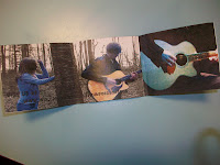

The Front cover shows the singer/guitarist sat playing in a spotlight in darkness. This is a simplistic cover but is highly effective as it promotes the video and shows the artist and song title.
The font is indie and does not look out of place on the cover compared to the genre.
This relates to the video as the video shows the artist performing in the spotlight on stage as a dancer performs around him.
The inside cover shows two key images from the video. One image shows a close-up of the artist playing the guitar on stage. The second image over two pages shows the girl in the narrative of the video breaking down leant on a tree. The guitarist is on the opposite side of the tree. He is almost a ghostly figure in the video and does not have a character in the narrative of the video. Overlaid on the image is the web address of the band to allow more content to be available to the buyer of the album.
The back cover is black and shows the song title, barcode and record label. The back cover shows the black stage and the artist in a faded spotlight shown on the cover. The inside flap of the cover shows an image from the video of the artist playing the guitar in the woodland setting. The back cover could include a different image from the video and also some more logos such as band logo and cd/dvd compatible logo.

Bullet for my Valentine - Dignity
The front cover shows a silhouette of the band performing in front of a flaming backdrop. The bottom of the cover is black and shows the title of the song in the same font as the band logo (top left of cover).
The back cover shows the band with their instruments walking along a runway. The cover shows the song titles in an eroded font that suits the genre of the band. There is also a barcode, record labels and credits at the bottom of the cover. This image relates to the video as the band performed on a runway to the camera. The cover is grey scaled to show the mood and emotion of the genre and to appeal to the gothic target audience.
The inside left cover shows a blend of images from the videos narrative relating to the theme of war. It shows the top secret plans burning alongside the army officer taking aim and looking stone faced toward the camera. These images illustrate the grungy depressing feel of the videos narrative and also relate to the song and the bands target audience.
The inside right cover which will hold the cd in front of it shows a blend of ripped up old photos that show the grungy vintage look of the video and also illustrate the appropriate moods for the song.
The cover is very effective, however the colour manipulation on the front cover should be used throughout the cover.

Daughter - If you leave
The front cover shows an image from the video of the two girls on top of each other. The girl on the bottom is trying to push the other girl down like she is her conscience. The girl being on top shows she has defeated her conscience. The font is clear and looks modern and not out of place with the video narrative and the song itself.
The back cover shows an image from the video of the dancer (conscience) behind the fire, so it looks like she is passing through it like a ghost. The track listing is in the same font as the front cover and there is also a barcode, record labels and licensing terms and conditions for the record label.
The inside left cover shows the two girls in the video lying down on the grass in the dark and looking toward the camera and therefore the person who has brought the cd. This is similar to the rest of the Digi pack and therefore compliments the theme and style of the video, song and cd.
The inside right cover where the cd will be cased is a close-up of the roaring fire seen in many shots during the video. This is simplistic but effective as many people will only look at this when taking the cd out and therefore it is not very important, however it cannot be left blank and undersigned.
The digi pack for this video is highly professional and has everything that is needed in a cd cover. It would not look out of place in a music shop or any where, where you are able to buy it. Also the cover is that professional I think it would sell well if put into stores.
Friday, 24 October 2014
Survey results / analysis
1. What is your age?
25x15-18 years, 4x40-46 (the other answers were fake)
2. What is your gender?


25x15-18 years, 4x40-46 (the other answers were fake)
2. What is your gender?
3. Which band do you prefer?
4.What is your favourite music video? (many answers from different genres and era's)
5.Would you rather watch a music video with a story or no story to it?
6.Where would your ideal location be to film the video? (many answers, a lot of people agreed with the use of the countryside and beach for Mumford and sons video)
7.With the above location in mind, what prop would you use? (majority of answers agreed with the idea of having instruments in the video)
8.What time of day would you film the video? (different times of the day were mentioned, many agreed with the use of sunrise or sunset to show romance)
9.Would you like to see scenes from the characters point of view?
10.Would you have a specific audience for the music video? (a few innapropriate fake answers, however many people agreed with the festival goer teen audience I had decided on)
Overall the feedback has been majorly positive. The Age of the viewer has been clearly defined from the survey. This was the age I was aiming the video towards as well. I wanted a mixed gender audience, but was wanting an influx of females rather than being solely 50/50. I am starring in the video also, so positive female feedback is also welcoming. It was also positive to see more people like Mumford than Arctic Monkeys. This made my final decision as to which song to do the final video on. I had a great idea for Arctic Monkeys but felt it would not look right without a professional film crew. The fact that many people wanted a narrative video is majorly positive as my video now has a heavy narrative to it, due to slight changes from the original idea. although i already had locations in mind for the video it was great to see that the participants agreed on the beach and country location for the video. Then asking about props they agreed instruments in the video would work well. This is why I will now have a guitar in the video throughout. The idea of POVs from the character in the video is positively received. This was originally going to be in the Arctic Monkeys video, however the positive influx has made me think about incorporating some POV shots into the Mumford video.
In conclusion the feedback has been greatly received and has effected me in a few ways. It has allowed me to understand why they want instruments in the video and also that i should incorporate POV shots into the final video.
Overall the feedback has been majorly positive. The Age of the viewer has been clearly defined from the survey. This was the age I was aiming the video towards as well. I wanted a mixed gender audience, but was wanting an influx of females rather than being solely 50/50. I am starring in the video also, so positive female feedback is also welcoming. It was also positive to see more people like Mumford than Arctic Monkeys. This made my final decision as to which song to do the final video on. I had a great idea for Arctic Monkeys but felt it would not look right without a professional film crew. The fact that many people wanted a narrative video is majorly positive as my video now has a heavy narrative to it, due to slight changes from the original idea. although i already had locations in mind for the video it was great to see that the participants agreed on the beach and country location for the video. Then asking about props they agreed instruments in the video would work well. This is why I will now have a guitar in the video throughout. The idea of POVs from the character in the video is positively received. This was originally going to be in the Arctic Monkeys video, however the positive influx has made me think about incorporating some POV shots into the Mumford video.
In conclusion the feedback has been greatly received and has effected me in a few ways. It has allowed me to understand why they want instruments in the video and also that i should incorporate POV shots into the final video.
Thursday, 23 October 2014
Weekly Update 5
This week i have completed a mood board on glogster showing a lot of images relating to my video or aspects of my video
Also this week i have completed, a powerpoint and published it on slideshare showing analysis of past student examples i found on youtube
Thats all for this week
Stay classy :)
Also this week i have completed, a powerpoint and published it on slideshare showing analysis of past student examples i found on youtube
Thats all for this week
Stay classy :)
Tuesday, 21 October 2014
Friday, 17 October 2014
Weekly Update 4
This week i completed the storyboard for my idea.
The storyboard was completed on Picasa- a comic book creator
Also this week i completed a blog on glogster on my specific target audience using AC Neilsons target audience survey criteria
Thats all for this week
Stay classy
The storyboard was completed on Picasa- a comic book creator
Also this week i completed a blog on glogster on my specific target audience using AC Neilsons target audience survey criteria
Thats all for this week
Stay classy
Thursday, 16 October 2014
Friday, 10 October 2014
Weekly Update 3
This week i have been working on my final idea presentation
the idea i have picked is the Mumford and Sons video for Hopeless Wanderer with the loose narrative of the relationship between a couple in romantic locations
Thats it for this week
Stay classy
the idea i have picked is the Mumford and Sons video for Hopeless Wanderer with the loose narrative of the relationship between a couple in romantic locations
Thats it for this week
Stay classy
Subscribe to:
Posts (Atom)